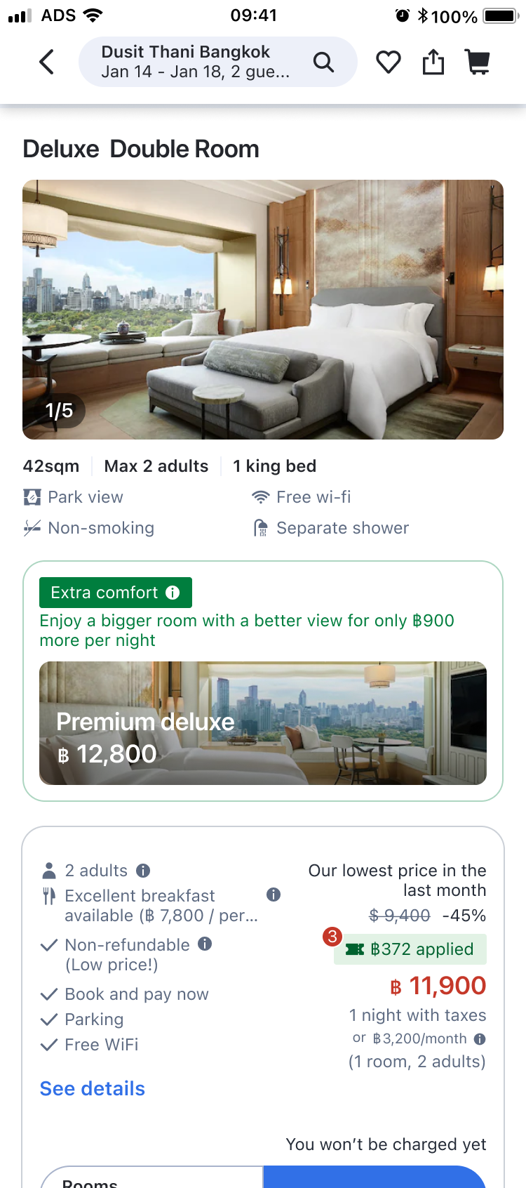
How might we turn a price-sorted list into a value-based decision?
80% of users booked the cheapest room — not by preference, but because the page gave them no basis to compare. Surfacing each room's value lifted non-cheapest bookings by 32%.
My Role
I led the design end-to-end — from hypothesis and 6 UX directions to recommendation logic and iterative shipping that compounded into the 32% lift.
Role
Product Designer
Platform
iOS · Android · Web
Team
PM · User Researcher · Engineering
+32%relative lift in booking rate
Before
→
After
Users who chose a non-cheapest room
+1,155bookings per day
Additional non-cheapest bookings per day
00
Process
How I turned a behavioral signal into a scalable design
80% booked the cheapest room without exploring. Identified the missed revenue signal.
Over 80% of bookings come from the cheapest room, signaling a missed revenue opportunity
Most bookings come from the cheapest room which is the lowest-margin option, creating a significant business gap at scale.
Booking distribution by room position
The first room captures over 80% of all bookings. Every higher-priced option combined accounts for less than 20%.
n = 12M sessions
80.87%
Cheapest
12.53%
4.32%
1.43%
0.19%
0.05%
0.09%
1st2nd3rd4th5th6th7th+
Room position (sorted by price, low to high)
02
Insights
Synthesized survey, behavioral, and interview data into clear segments and the gaps that drive cheapest-room defaults.
When we asked users, their intent didn't match their behavior.
To understand the intent behind the data, we surveyed 5,200 users. Most said they'd happily pay more for a room that better fit their needs. But in actual booking data, only 20% came from higher-priced rooms.
Intent · Survey (n=5,200)
said they'd pay more for a higher-priced room
74%
Reality · Booking data (12M sessions)
of bookings actually came from a higher-priced room
20%
The opportunity
The gap between what users said and what they actually booked pointed to clear room for improvement. So I set out to understand why so many users open to upgrading still end up choosing the cheapest room.
Defining the target
Who are these users open to upgrading?
From the survey responses and behavioral patterns, two distinct groups emerged within cheapest-room bookers: users who strictly stick to the lowest price, and users open to upgrading when value is clear. The split helped define who we were actually designing for.
"I don't compare rooms. I just need the cheapest one."
Price-sensitive users
26% self-identified in survey (n=5,200)
This segment doesn't care about room differences. They decide on the property that meets their needs, then finish booking by picking the cheapest room.
"I'd pay more if I could see what I'm getting and if the price is reasonable based on the benefits."
Value-open users
74% self-identified in survey (n=5,200)
This segment browses rooms, taps into details, and spends some time comparing. They're open to paying more, but the page doesn't surface what the premium actually gets. So they default to cheapest.
We decided to focus on value-open users — travelers who actually browse rooms and want to understand the differences, but end up defaulting to the cheapest option because the page never gives them an actionable difference to weigh. They're the segment most likely to upgrade if the value is made visible.
So why do these value-open users still default to the cheapest?
Two main reasons surfaced from the survey, accounting for the majority of the gap.
Insight 1
Recognition gap
Users don't understand the difference between room types.
68% of responses
24%Photos look similar
18%Too many options
11%Worried I'd regret paying more
Insight 2
Value-price imbalance
Users see the difference, but feel the price gap is too high for the benefit.
32% of responses
Survey · n=5,200 · multi-select
Recognition gap
Users don't understand the difference between room types.
Deep dive 1
Why can't users tell the difference between room types?
To find out why, I audited the current room selection page and found three structural problems that left users with no way to compare.
Scroll inside to explore
Three reasons users can't tell rooms apart
1
Cards bury the key attributes in noise
Each card piles on benefits, discounts, cancellation rules, and payment terms. The actual room differences disappear in the clutter.
2
Long vertical scroll prevents side-by-side comparison
Users have to scroll back up to remember the previous room. Comparison happens from memory, if at all.
3
"Recommended" without a reason
Some rooms carried a "Recommended" badge, but the page never said why. Users had no basis to trust it.
Value-price imbalance
Users see the difference, but feel the price gap is too high for the benefit.
Deep dive 2
Why don't users feel the benefit is worth the premium?
32% saw the difference between rooms but felt the benefit didn't justify paying more. To understand why, I split the question into two hypotheses to test.
Users feel the price gap is too high for the benefit because:
AHypothesis · Value
The benefit feels too small for the premium.
Deep dive → Which benefits make users feel the upgrade is worth paying for?
BHypothesis · Price
The price gap feels too large for the benefit.
Test → How much price gap can each benefit carry?
AValue
Which benefits make users feel the upgrade is worth paying for?
Survey · n=5,200 · Multiple choice
54%
Bigger room size
47%
Better view
36%
Free breakfast / perks
28%
Price promotion
14%
Higher floor / quieter
Users respond most to direct experience benefits — bigger room and better view — far above indirect levers like discounts or floor level. These two became the upsell's lead value.
BPrice gap
How much premium can each benefit carry?
In general, smaller premiums are likely to feel more reasonable, leading more users to consider upgrading. However, tolerance might vary by benefit — for example, a 10% premium for an ocean view feels different from a 10% premium for a higher floor. So we chose to validate it through experimentation by trying different ranges of price gaps.
03
Design
Process overview
Framed the two information gaps and the combined hypothesis that ties them together.
How might we bridge the gap to make higher-priced rooms feel worth choosing?
Problem 1
Recognition Gap
Users don't understand the differences between rooms.
Hypothesis
If we make it easier to compare rooms, users will have enough context to book a non-cheapest room.
HMW
How might we make rooms easier to compare?
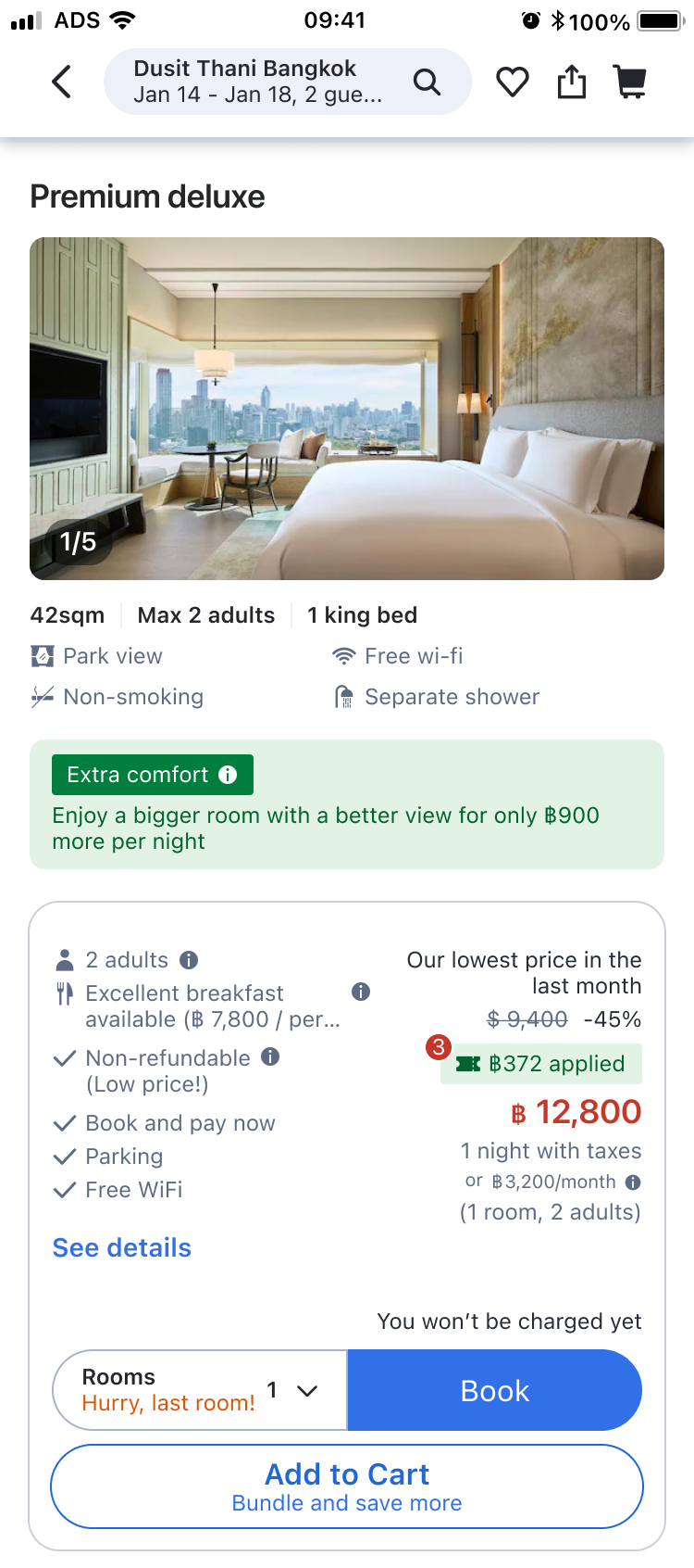
Solution
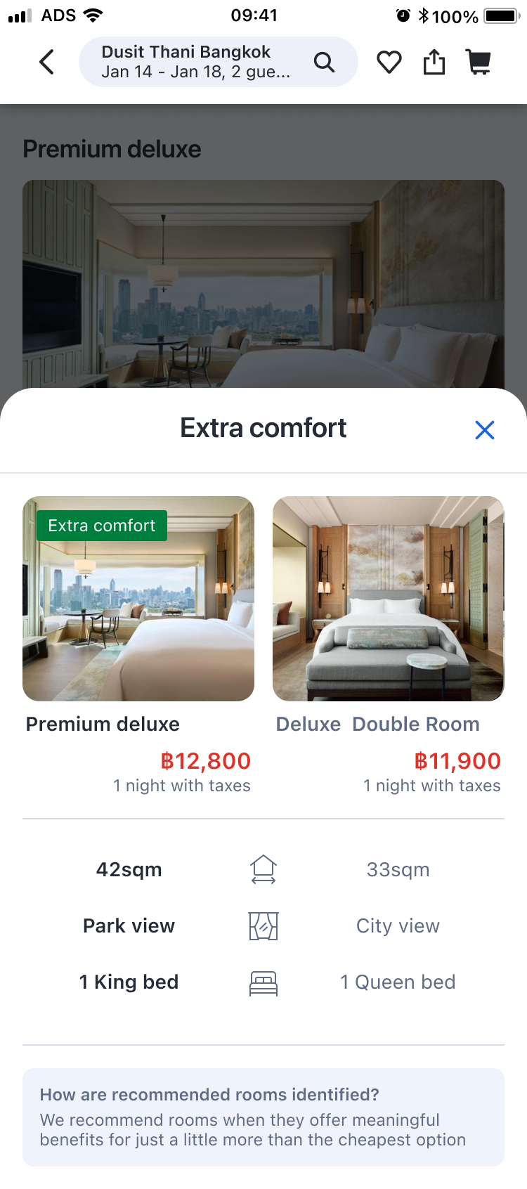
Track 1 · UI
Side-by-side comparison sheet
Inline banner on the recommended room opens a bottom sheet that shows it directly against the cheapest.
Problem 2
Value-Price Imbalance
Users can't tell if the premium is worth what they'd get.
Hypothesis
If we highlight rooms where the benefit matches the premium, the upgrade will feel reasonable rather than arbitrary.
HMW
How might we recommend rooms that feel worth the premium?
Solution
Track 2 · Logic
Benefit-matched recommendation rules
Rules that tie the allowed price premium to the actual benefit.
Final solution hypothesis
If we highlight rooms where the value justifies the price and make them easy to compare to the cheapest, users will be more likely to consider upgrading.
03
Design
Track 1: Solving the recognition gap
Surfaced room differences without restructuring the page or pressuring users.
1
Track 1
Solving the recognition gap
Understanding constraints
How can we highlight one room against the cheapest so users immediately see the value?
I considered three concept-level ways to close the information gap, and chose the one that could validate the hypothesis within the existing constraints.
Concept A
Compare every room in a grid
$
$
$
$
$
$
$
$
✕Out of scope
Page-level redesigns were out of scope. Users browse ~1.5 rooms on average, so this would require an intervention far down the fold.
Concept B
Annotate differences on every card
$
$
$
✕Dilutes the signal
Annotating every room spreads attention thin and dilutes the signal. The hypothesis needed one clear contrast point, not many.
Concept CChosen
Highlight one room against the cheapest
Cheapest option
$$
vs
Recommended
$$$
✓Why it fits
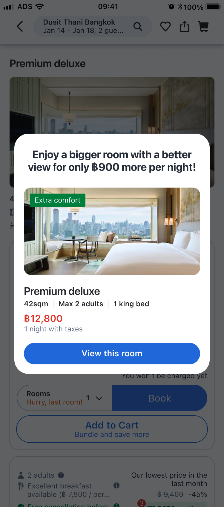
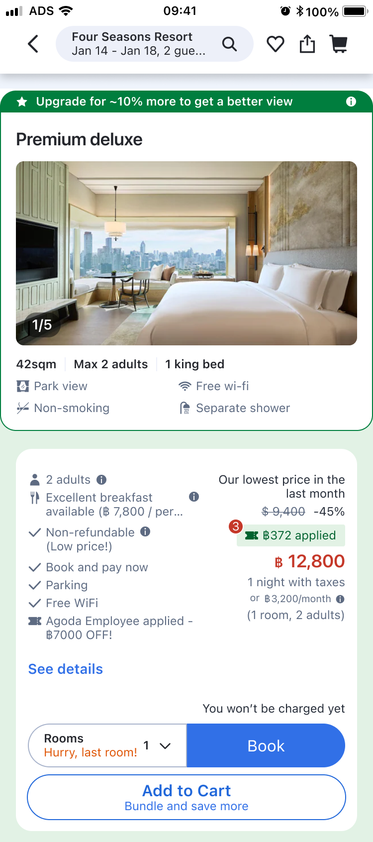
Touches only the recommended room, creates a direct comparison high in scroll, and informs users without pressuring price-sensitive users.
Design decision
Choosing how to surface "Highlight one room against the cheapest" in the UI.
Define what good looks like, weigh the trade-offs across five options, then commit.
1. Define evaluation criteria
Information clarity
Does the user get enough context to compare?
Conversion potential
Can it actually drive non-cheapest bookings?
Intrusion risk
Does it feel like pressure or too intrusive?
Implementation complexity
Can it be built within the existing structure?
2. Explore 5 approaches
A
Banner + bottom sheet
Show one recommended room with side-by-side comparison.
B
Modal
Display comparison in a modal overlay.
C
Jacket card
Add a separate card above the list to show comparison.
D
Inline banner
Show comparison inline within the list.
E
Filter chip
Let users filter to see only better-value rooms.
3. Evaluate trade-offs
A · Inline banner + bottom sheet Chosen
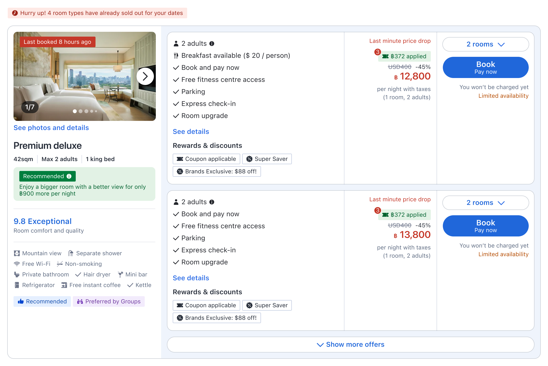
Recommendation banner placed on the room card. Tapping opens a bottom sheet with a side-by-side comparison of the two rooms. The user initiates, and gets full context in one tap.
Pro
User-initiated, zero friction for those who don't need it. Full comparison context in one tap.
Con
Banner visibility depends on the user scrolling to the recommended room card.
Info clarityHigh ✓
ConversionHigh ✓
Intrusion riskLow ✓
ImplementationLow ✓
Why Option A wins
Every other option forced a trade-off between visibility and intrusion. Option A was the only one that resolved both — letting the user decide when to engage, and clearly showing the information and comparison once they did.
No interruption, no pressure
Price-decided users never encounter it — it doesn't disrupt the cheapest room booking flow.
Clear visibility
Value-open users see a clear recommendation right on the card they're scanning.
Easy comparison
One tap opens a side-by-side view with benefit, price delta, and both rooms.
Low implementation cost
Works within the existing card structure — no restructuring of the room selection page.
B · Modal
A popup opens when the user scrolls down to the recommended room position.
Pro
Can show the recommended room upfront, high visibility.
Con
Auto-triggered without user intent. Disrupts the cheapest room booking flow.
Info clarityHigh
ConversionMid
Intrusion riskHigh ✗
ImplementationMid
→ Decisive weakness: Intrusion risk
Auto-triggered without user intent — it interrupts price-decided users before any engagement signal.
C · Jacket card
Recommendation marked on the room card jacket. Tapping opens the comparison bottom sheet.
Pro
Non-intrusive, sits within the existing card structure.
Con
The jacket area isn't where users focus. Visibility is too low — most users scroll past without noticing.
Info clarityMid
ConversionLow ✗
Intrusion riskLow
ImplementationMid
→ Decisive weakness: Conversion potential
The jacket area sits outside the user's scanning path — most users scroll past without noticing.
D · Inline banner
Comparison banner attached directly to the cheapest room card.
Pro
Highest exposure since the cheapest room gets the most engagement.
Con
High risk of disrupting price-decided users. Card height grows, worsening the "hard to see all rooms" problem.
Info clarityHigh
ConversionMid
Intrusion riskMid
ImplementationHigh ✗
→ Decisive weakness: Implementation
Attaching to the cheapest card grows its height and worsens the "hard to see all rooms" problem it was meant to solve.
E · Filter chip
A "Recommended" filter chip added above the room list.
Pro
Easy to add without touching the card structure.
Con
Hard to convey what "recommended" means through a filter alone. Can't reach value-open users who have no intent to filter.
Info clarityLow ✗
ConversionLow ✗
Intrusion riskLow
ImplementationLow
→ Decisive weakness: Info clarity + Conversion
A filter requires intent the target segment doesn't have — and can't convey what makes a room "recommended" on its own.
03
Design
Track 2: Solving the value-price imbalance
Tied the allowed price premium to the actual benefit, so upgrades feel proportional.
2
Track 2
Solving the value-price imbalance
Defining the logic
How do we make a recommended room feel genuinely valuable?
Users mentioned that even when they understood the benefit, the price gap still felt too high. To solve this, I tied the allowed price premium to the actual benefit a user gets, so the price feels reasonable for what they get.
Solves the value–price mismatch (both directions)
A recommendation only surfaces when the benefit is proportional to the price difference.
We check every non-cheapest room against the cheapest. Both checks must pass to qualify.
Our recommendation logic
1 · Baseline
Cheapest room
$210 / night
Used as the anchor point so users can easily compare benefit and price.
→
2 · Compare the difference
Is the upgrade noticeable?
Room size
At least 10% bigger.
View
Meaningful added benefit.
→
3 · Evaluate price vs value
Is the extra cost worth the extra benefit?
Size onlyup to +10%
Size + viewup to +20%
Limit the price gap to +20%
How it works in practice
Baseline · Cheapest
Standard City
$210/ night
Reference point for every other room.
Recommended
Deluxe Park view
$235/ night+12% more expensive
+12% bigger
Ocean view
Strong value for a small price increase.
Not qualified
Junior Suite
$305/ night+45% more expensive
+22% bigger
Ocean view
Price gap too large for the extra benefit.
04
Iteration & Outcome
Three iterations compounded into a 32% lift. Non-cheapest booking rate 22% → 29%, p = 0.002.
Non-cheapest booking rate increased 32%, with no impact on cheapest room bookings
Three metrics defined upfront — primary, guardrail, business. Each card shows the gate I set, the data, and what it means.
Primary · User behavior
Are users acting on the value we surfaced?
Non-cheapest room booking rate
22%
Before
+32%Relative
29%
After
Users book higher-priced rooms when they can clearly see the value.
We saw a meaningful data impact on non-cheapest bookings — the design closed the information gap, not just the visibility gap.
Guardrail · Segment protection
Did this disrupt price-sensitive users?
Cheapest room booking rate
No movement
51.11%
Before
51.09%
After
A user-initiated pattern doesn't disrupt price-sensitive users.
Cheapest-room demand stayed stable through the rollout — no popup, no pressure, no drop in fast-booking flow.
Both ADR and incremental bookings moved meaningfully — real growth at Agoda's scale.
How we got there
Three iterations, each refining the next
Each phase shipped a small, focused change. No single design moved the metric on its own — the compounding effect drove the final outcome.
Phase 1Banner only
We shipped a recommendation banner inside the room card showing the benefit and price delta.
~1.5%Banner CTR
FlatBooking conversion
The click signal confirmed that users noticed the information gap, but it wasn't enough to convert.
Phase 2Adding the comparison
I added a bottom sheet showing both rooms side by side so users could clearly compare the room types.
+5%Conversion lift (when shown)
~25%Coverage
Conversion improved meaningfully for users who saw it, but the coverage was limited.
Phase 3Expanding coverage
We expanded the coverage: including web users in the impact segment, and increasing the number of recommended rooms shown per user. With broader reach, we finally validated the hypothesis.
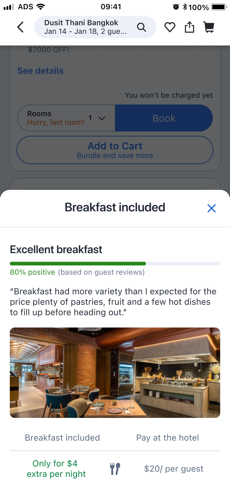
Phase 4Offer upsell · Breakfast included offer
The same recognition gap exists one level down — 80% of users still pick the cheapest offer within a room. The next experiment applies the same pattern at the offer level, starting with breakfast: the clearest benefit, most available supply.
05
What's Next
Coverage expansion, segment research, and applying the same logic to offer-level upsell.
From a validated pattern to a scalable strategy
The design works. What's left is scale. 60% of users never saw the banner, and the same information gap exists one level deeper, at the offer level.
Coverage expansion
When, where, and how should we show the recommendation so more users recognize the value and convert?
The comparison logic works when users see it. The priority is to make sure more of them do.
Insight
The comparison experience worked — only for users who scrolled far enough.
60% of users never saw the banner.
The design wasn't the bottleneck; reach was.
Opportunity
If we surface the recommended option at the right moment — where users can easily see it — and make the value easy to understand, more users will choose non-cheapest offers.
Action item
Test placement positions and broader conditions.
Placement variants (inline, sticky, top of list)
Trigger timing & frequency
Broader recommendation rules
Different funnel stages (RG, BF)
Segment personalization
How might we communicate the right upgrade for each traveler's context?
Family travelers responded most. Solo travelers the least. The same banner shouldn't speak to both.
Insight
Travel context shapes what counts as value.
Family travelers showed the highest upgrade interest.
Solo travelers the least.
Yet every user saw the same banner.
Opportunity
Match the framing to each segment's travel context.
If we highlight the benefit and messaging that matches each traveler's context, more users will recognize the upgrade as personally relevant and choose non-cheapest offers.
Action item
Segment by travel type, then test variant messaging.
Family — emphasize room size & shared space
Business — emphasize quiet & convenience
Solo — price-first framing
Track CTR + booking rate by segment
→ Starting now · Breakfast upsell
How might we extend the same pattern to other benefits beyond rooms?
This isn't a future bet — the conditions are already met. 50%+ of properties offer breakfast within a 15% price gap. The same recognition gap exists, and the same design pattern applies.
Insight
The room-level pattern worked, but the gap repeats.
80% of users still pick the cheapest offer within a room.
Differences hide across cancellation, pay-later, breakfast.
Opportunity
If we surface higher-value offers with clear benefit framing at the right moment, users open to spending more will recognize the value and choose them over the default cheapest option.
Action item
Start with breakfast — clearest benefit, most supply.
50%+ of properties offer breakfast within 15% price gap
Direction 1: Price rationality
Direction 2: Breakfast experience
Deep dive · Two ways to frame the value
01
Price rationality
Show the cost of adding breakfast at the hotel vs. including it at booking. Make the savings amount feel like the better deal.
02
Breakfast experience
Show menu photos or positive reviews. Communicate the clear value of the breakfast, not just the price difference.
The bigger bet
Room upsell was the first proof. The real product opportunity is value-based recommendation across the entire booking journey — from rooms, to offers, to the property itself.
06
Area of Growth
What this project taught me about reading early signals and designing within constraints.
Lessons that scale beyond this project
Reading early signals through small experiments, then scaling
Phase 1's flat booking result could have been read as "the feature doesn't work." Instead, separating attention signals from conversion signals revealed the real gap: users needed comparison, not just a label. Small experiments made this visible before we committed to scale.
Working within constraints to solve as much of the problem as possible
The room selection page structure couldn't be redesigned, so the full original problem (hard to see all rooms at a glance) stayed unsolved. But by reading the constraints clearly with the team, we defined where the recommendation-based approach could go furthest, and designed around what we couldn't change.